Thursday, 29 March 2012

Question 7:

Looking back at your preliminary task, what do you feel you have learnt in the progression from it to the full product?

Here is a link to a video i made to answer this question
http://www.youtube.com/watch?v=OoIGitJam9I

Question 6:

What have you learnt about technologies from the process of constructing this product?
During the first media lesson of the year i had no past experience using a mac. I learnt how to use shortcuts and hotkeys to carry out task quicker and easier. The program we used to create our magazine was In-Design. I had never used In-Design before so all the tools were new to me. One of the most important things i learnt about these new technologies was how to wrap text around and image or shape. I used this technique to make the text wrap around background images on my double page spread and to place images into the middle of text.

To edit alot of the images on my magazine i used Photoshop. Photoshop helped me create the right shapes for my images and even helped me create the logo for my magazine. On Photoshop I had to outline a picture of a guitar then fill it with a colour then drag it onto my In-desgin page. I learnt how to create different shapes by creating edit points and dragging them out to create my desired shape.

To publish our coursework we used Blogger. I have never used a Blog before so I was new to creating posts and edditing them although the style and layout helps alot as it works almost like a diary so all of my work is kept organised. Technologies are very important when producing a piece of media as with every new product innovations need to be made to keep audiences interested and for the magazine to be able to relate to the audience.

Question 4/5:

Who would be the audience for your media product?

How did you attract/address your audience?


Here is a link to a prezi I made to answer questions 4 and 5.
http://prezi.com/_ndcnjxmuabr/question-4-5/

Monday, 19 March 2012

Question 3:

What kind of media institution might distribute your media product and why?
The company I have chosen to distribute my magazine is Bauer. I have chosen this as it is a fairly large distributor with alot of different ways of distributing media. They also cover a large amount of genres and magazine types.

As you can see from the image below this distributor already is in business with kerrang and Q which are very big magazines. Q is simular to the genre of my magazine as it features a lot of indie bands and the genre of my magazine is indie-acoustic. Buear do not distribute a magazine like mine at this moment so it could be a chance for it to create a new audience by combining ones from the exsisting magazines with other audiances that are looking for a magazine like mine to be on the market. Bauer will help get my media out in various ways which will help profits as they have alot of their magazines with radio stations, online websites and even some with mobile access, this would help get my product into the market by using modern technology.

Add caption


Question 2:

How does my media product represent particular social groups?


The layout and style of the cover on my magazine reinforces the Stereotypes of an indie-acoustic guitar players with his casual dress sense, hairstyle and the place that the image is taken. The posture of the character on the cover is passive and unthreatening where as if it was a cover for a death metal magazine i may choose to make the character more aggressive and dominant.

The price and the artists I've chosen to feature also represent a particular social group as my magazine is priced at £2.99 which is not easily affordable to everybody so the main buyers of my magazine will probably be middle class. I've included both male and female artists in my magazine to both genders are represented to keep the potential audience as large as possible. The artists featured in the pictures of my magazines have particular dress sense which is very popular with the age of my target audience in todays society. For example, in the album cover, The artist is wearing chinos. Chinos worn a lot by Ed Sheeran who is very popular with the target audience of my magazine and is also featured in my magazine. The Coat my artist is wearing is a very popular coat these days so that will also represent a large proportion of males and females.

The artist i have featured on my Contents page displays an alternative style which would help to represent members of the potential audience that deviate from the norm. I have tried to represent as much 

Monday, 5 March 2012

Question 1:

 In what ways does my product use, develop or challenge forms and conventions of real media products?

My cover uses forms of a regular music magazine as it includes the basic style of main image with smaller sub images around it with cover-lines and a clear, bold masthead. I have included conventions such as barcode, main image and cover-lines to keep the feel of a regular magazine but i have developed on a few aspects. The genre of my magazine is Indie-Acoustic, there are not a lot of magazines that focus on this particular genre. I have also tried to include newer technology on the magazine by offering a free MP3 download rather than a poster.

Here is an analysis of my cover and its conventions

In my contents page I have used a colour pallet like other magazines, I chose my pallet to be black, white and red, i chose these colours because it makes the red stand out. so i can use it to create noticeable conventions like exclusive stamps and banners. I used images to illustrate the features in my magazine. I have kept a regular style to keep the structure simple and easy to understand. I did not want to challenge anything because I didn't see the benefit as audiences tend to dislike change.

Here is an analysis of my contents and its conventions

My double page spread challenges the norm as it features a slightly unknown artist while most magazines tend to focus on mainstream artists. I have kept the convention of a large image and made the text wrap around the image. I have kept the font size 12 which is large enough to be read easily but not too big and is used a lot by other magazines.

Here is an analysis of my double page spread and its conventions

Monday, 30 January 2012

Preliminary cover

This is my preliminary cover. I asked my peers what they think I should improve, they recommended I make all the fonts on the cover the same style and make the masthead a lot more noticeable. 

Monday, 16 January 2012

Techniques used on double page spread

I needed to wrap text round the shoulder of the image but as this picture was a background image i had to create a new shape and mould it to the shape of the shoulder then wrap the text around that to give the impression the text is wrapping around his shoulder.
For the background image of the double page spread the original image was around 50mm too small in terms of width, to resolve this problem I had to double up the image and then crop from left to right so it appeared that the bricks continued.

Masthead and logo


This is the masthead I made, i used the background to make the title of the magazine stand out on the front page. I created the logo by getting a picture of an acoustic guitar from the internet then tracing around it on photoshop then, after that, filling it in white and creating a black circle to clearly show the genre of the magazine.

Monday, 9 January 2012

Practice double page spread

Second attempt

I have included a page number and magazine title and the bottom of each page. I also inserted an image into a photo box then used text wrap from the window menu and pushed the text 1mm out horizontally and 2mm vertically.
First attempt

Wednesday, 28 December 2011

Photography for Magazine


Music Magazine Proposal

The target audience for my Music magazine are ages 16 to 25 male and females which attend college or university. I will achieve this by using unisex font and colours and use features that appeal to both genders. I will use sophisticated language yet exciting to maintain the class of audience and keep it from being too dry and boring. My magazine follows an acoustic theme which is very broad which means it can include a lot of content and types of artist as a lot of artist do acoustic versions of their songs. I will use an informal style of writing to relate to audience and make the magazine a lot more fun to read.

The indie-acoustic genre I have adopted will allow me to use a variety of artists, instruments and live performances to create features about. I will include cover lines like '2011's Greatest releases' and 'Chris.B, Exclusive interview' to keep current as I will be creating a January 2012 edition of the magazine which will include an overview of the past years albums and exclusive information about a new release for 2012.

I have decided to title my magazine 'Acoustic vibe' as it is clear what the genre of the magazine is and relates to music very easily. I rejected such titles as 'Resonate' and 'Clear vibration' as I wanted a title that clearly states the genre. I will also include a logo of a outline of an acoustic guitar by my title to exaggerate the genre even more.

The frequency of publishing the magazine will be the first Monday of every month. It will have special editions such as seasonal editions but in this case a new year edition. The main image for the cover will include a long shot of the artist 'Chris.B' holding a guitar with the cover-lines, masthead and banner surrounding him. His image will represent the target audience.

Monday, 12 December 2011

Flat Plans

Flat plans for Front cover


Flat plans for Contents

Flat plans for Double page spread

Monday, 28 November 2011

Research

Q


Q LOGO This is Q's Logo. The logo is simple and yet different which works well as it represents and relates to the bands that they feature. Q music magazine focuses greatly on alternative and indie types of bands. Founders Mark Ellen and David Hepworth were dismayed by the music press of the time, which they felt was ignoring a generation of older music buyers who were buying CDs — then still a new technology. Every other month, Q has a special edition. These have been about musical times, genres, or a very important/influential musician. This attracts a bigger audience by creating things to look forward to and including exiting features.Q's current editor is Paul Rees, former editor of the UK edition of Kerrang! Kerrang has a different style to Q magazine but as the editor has worked on Kerrang it will broaden the audience and create a less strict genre. Q now has a Radio station and a TV channel as well as a magazine which will create more publicity and bring in more money. The magazine currently sells at £3.90 and is published monthly. The target audience varies depending on the content of the magazine but it is mostly aimed at 16 - 25's of both gender The audience is split 75% male to 25% female and is affluent (with 68% ABC1) who listen to an individual genre of music which is shown by the sophisticated logo as it does not use lots of colours which would be more appropriate for a younger audience.

Lady Gaga Cover This is one of Q's Covers. The main image covers up a lot of the key features on it which makes the main image stand out. Even though the logo and the main cover line is partially covered up we still understand what magazine it is as it is well known as well as the main feature cover line. The other cover lines are placed around the main image to make it stand out more and the fact that the image appears to be 'sandwiched' between the word Gaga makes the image seem 3D. Sex appeal is used in this cover to attract more of a male audience.

Kerrang!

Kerrang Logo This is the logo for kerrang! This logo is a lot more 'scruffy' and out of the ordinary than Q which attracts a more specific audience. Kerrang is a UK-based magazine devoted to rock music. It was first published on June 6, 1981 as a one-off supplement in the sounds newspaper. Named after the onomatopoeic word that derives from the sound made when playing a power chord on an electric guitar, Kerrang! was initially devoted to the new wave of British heavy metal and the rise of hard rock acts. In the early 2000s it became the best-selling British music newspaper. Angus Young of AC/DC appeared on Kerrang!'s first cover which initiated the style and genre that the magazine would commit to to keep a sustained audience . Launched as a monthly magazine, Kerrang! began to appear on a fortnightly basis later, and in 1987 it went weekly. 

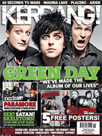
Green Day Cover The way Green Day are represented on this cover reflects the style of the target audience. The main image is again in-front of the cover title which shows that the content of the magazine is a lot more important than the magazine title itself as regular buyers will buy the magazine regardless of the content but in order to attract more buyers the magazine will have to try to draw them in with images that stand out.


Vibe


Vibe Logo This is the logo for the magazine Vibe. Vibe is magazine for the Hip-Hop genre. The magazine owed its success to featuring a broader range of interests than its closest competitors The source and XXL which focus more narrowly on rap music, or the rock & pop-centric Rolling Stone and Spin. As of 2007, Vibe had a circulation of approximately 800,000. Advertisers ran the gamut from record labels to fashion houses to various cognac brands.
Eminem Cover In this cover there is one image which is a mid-shot of a feature in the magazine. The cover is very neat and organised with a very basic background and not a very wide variety of colour unlike other magazines like Kerrang. This helps define the different types of audience and shows that a different template is used for different types of genre.


Cover analysis'


Monday, 21 November 2011

Final Cover

First Cover Attempt

Initially my sub image had no border around it which i felt looked too tacky so i included a order to make it blend in a lot easier. I also created a shape to go behind my main cover line to make it stand out a lot more better and it also exaggerates the colours making it more eye catching. Lastly I changed the order of the cover lines so the feature of the main image was easily visible.
Final Cover Attempt

This is my Final attempt at my cover. I have chosen to include a pug as it highlights a good reason to pick up the magazine and is eye catching due to the bright color. I have used less bold font for the date as it is a lot less important than the other cover lines and Masthead. I have decided to place the Masthead at the top centre/left side of the page. I chose to put it there because it does not get in the way of the main image and it will be the first thing people will see when they look at the magazine so it was important that i made it look attractive, eye catching and interesting which is why i included a tagline under my masthead. My tagline is "your college, your news" this engages with the audience and makes them feel more personal with the magazine concluding in them feeling more liable to read it. I have a sub image which gives the audience a quick insight as to what is featured inside the magazine. The colours i have used make the text stand out and is not biased to a more female nor male audience.

Photography, Masthead and Cover lines

                                                                  Photography for cover
This is the main image for my magazine. I have chosen this because it is college related and fits the specification of a midshot including one person. The person it includes resembles the main target audience for his magazine making it more attractive to passer byes. The image also relates to the main feature of my magazine.

Coverlines
The cover lines i have cosen to use are "10% off your  NUS card" this will attract readers as they will want to save money and as the magazine is free they will have no reason not to read the magazine. Another cover line i have chosen to use is "Courtyard in November, whats on the menu?" I chose this because it will give insight on what themed dish's the cafe would be serving for example children in need themed biscuits, this could potentially create more money for the college by encouraging people to buy from the college cafe rather than shops outside of college. My main cover line is "Are you happy with your subjects?" This is an appropriate cover line because November would be the time that any First years would have gotten used to their course and developed a certain like or dislike to it.


Masthead
This is my Masthead. i chose this font as it is a classic example of college font featured frequently in movies or on college hoodies. I have kept the color basic to keep the potential audience as wide as possible by not being biased as black is a neutral color. I created a tagline to create a relation between the reader and the magazine.


Monday, 7 November 2011

Proposal

I am aiming my magazine at 16 to 20 year olds of either gender who attend Southdowns College. I will achieve this by using unisex font, colour and features. I will use appropriate language and images to appeal to my target audience by making the features relative to college life and activities happening close to college. I will make the language relatively easy to read and use informal style to relate to the audience.

My magazine will mostly be about college life and things that will help with getting to college, finding places and doing better in your classes by providing tips and activities that could help to improve performance. I will use cover lines like "Fastest way to get to college" or "Chess champ, Meg's touching struggle".

I have decided on the title "SDC Today" as it is relevant to college and fits well on the cover. I rejected some titles such as "Southdowns college news" as it was too original and long and would not look good on my cover. For my tagline I would have "Your college, your knowledge" as it is referring to the fact that you deserve to know whats going on in your own college also it is catchy because it rhymes.

The magazine would be published monthly with occasional seasonal specials in months like october or december advertising halloween or christmas events. An example of a cover image for my magazine would be a medium close up of a student using one of the college facilities.

Monday, 31 October 2011

Flat Plans

Front page flat plans.

Contents flat plan. 

Initial ideas

My first idea for my magazine was that i would make it a music magazine and that i needed a cover and title that would appeal to my target audience. From this i made a specification on what my target audience was and what i could use to appeal to them.

  • 16 to 20 year olds - By using language and colours that appeal to this age group and using words that aren't too lengthy
  • Students at college - by making it quick and easy to read so it is not too time consuming.
  • Male and female - by making nothing gender specific for example no quizzes that involve 'how much you love justin bieber' and using colours that appeal to both genders.
  • Middle class - using language that will be easy to read but not too dim witted.
I will include on the front page a main image relevant to college life with a cluster of sub images displaying multiple features in the magazine