Q
Q LOGO This is Q's Logo. The logo is simple and yet different which works well as it represents and relates to the bands that they feature. Q music magazine focuses greatly on alternative and indie types of bands. Founders Mark Ellen and David Hepworth were dismayed by the music press of the time, which they felt was ignoring a generation of older music buyers who were buying CDs — then still a new technology. Every other month, Q has a special edition. These have been about musical times, genres, or a very important/influential musician. This attracts a bigger audience by creating things to look forward to and including exiting features.Q's current editor is Paul Rees, former editor of the UK edition of Kerrang! Kerrang has a different style to Q magazine but as the editor has worked on Kerrang it will broaden the audience and create a less strict genre. Q now has a Radio station and a TV channel as well as a magazine which will create more publicity and bring in more money. The magazine currently sells at £3.90 and is published monthly. The target audience varies depending on the content of the magazine but it is mostly aimed at 16 - 25's of both gender The audience is split 75% male to 25% female and is affluent (with 68% ABC1) who listen to an individual genre of music which is shown by the sophisticated logo as it does not use lots of colours which would be more appropriate for a younger audience.
Q LOGO This is Q's Logo. The logo is simple and yet different which works well as it represents and relates to the bands that they feature. Q music magazine focuses greatly on alternative and indie types of bands. Founders Mark Ellen and David Hepworth were dismayed by the music press of the time, which they felt was ignoring a generation of older music buyers who were buying CDs — then still a new technology. Every other month, Q has a special edition. These have been about musical times, genres, or a very important/influential musician. This attracts a bigger audience by creating things to look forward to and including exiting features.Q's current editor is Paul Rees, former editor of the UK edition of Kerrang! Kerrang has a different style to Q magazine but as the editor has worked on Kerrang it will broaden the audience and create a less strict genre. Q now has a Radio station and a TV channel as well as a magazine which will create more publicity and bring in more money. The magazine currently sells at £3.90 and is published monthly. The target audience varies depending on the content of the magazine but it is mostly aimed at 16 - 25's of both gender The audience is split 75% male to 25% female and is affluent (with 68% ABC1) who listen to an individual genre of music which is shown by the sophisticated logo as it does not use lots of colours which would be more appropriate for a younger audience.
Lady Gaga Cover This is one of Q's Covers. The main image covers up a lot of the key features on it which makes the main image stand out. Even though the logo and the main cover line is partially covered up we still understand what magazine it is as it is well known as well as the main feature cover line. The other cover lines are placed around the main image to make it stand out more and the fact that the image appears to be 'sandwiched' between the word Gaga makes the image seem 3D. Sex appeal is used in this cover to attract more of a male audience.
Kerrang!
Kerrang!
Kerrang Logo This is the logo for kerrang! This logo is a lot more 'scruffy' and out of the ordinary than Q which attracts a more specific audience. Kerrang is a UK-based magazine devoted to rock music. It was first published on June 6, 1981 as a one-off supplement in the sounds newspaper. Named after the onomatopoeic word that derives from the sound made when playing a power chord on an electric guitar, Kerrang! was initially devoted to the new wave of British heavy metal and the rise of hard rock acts. In the early 2000s it became the best-selling British music newspaper. Angus Young of AC/DC appeared on Kerrang!'s first cover which initiated the style and genre that the magazine would commit to to keep a sustained audience . Launched as a monthly magazine, Kerrang! began to appear on a fortnightly basis later, and in 1987 it went weekly.
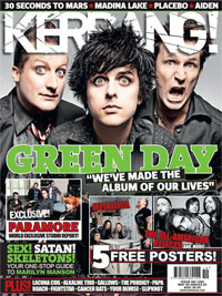
Green Day Cover The way Green Day are represented on this cover reflects the style of the target audience. The main image is again in-front of the cover title which shows that the content of the magazine is a lot more important than the magazine title itself as regular buyers will buy the magazine regardless of the content but in order to attract more buyers the magazine will have to try to draw them in with images that stand out.
Vibe
Vibe Logo This is the logo for the magazine Vibe. Vibe is magazine for the Hip-Hop genre. The magazine owed its success to featuring a broader range of interests than its closest competitors The source and XXL which focus more narrowly on rap music, or the rock & pop-centric Rolling Stone and Spin. As of 2007, Vibe had a circulation of approximately 800,000. Advertisers ran the gamut from record labels to fashion houses to various cognac brands.
Eminem Cover In this cover there is one image which is a mid-shot of a feature in the magazine. The cover is very neat and organised with a very basic background and not a very wide variety of colour unlike other magazines like Kerrang. This helps define the different types of audience and shows that a different template is used for different types of genre.
Cover analysis'


